Resources
A visual guide using my typefaces as examples to illustrate OpenType features…
Jump to…
- Contextual Alternates
- Stylistic Alternates
- Beginning/Initial, Isolated, Ending/Final forms
- Swashes
- Stylistic Sets
- Titling Alternates
- Ligatures
- Discretionary Ligatures
- Small Caps
- 3/4 Caps
- Decorated Caps
- Ordinals
- Lining and Old Style Numerals
- Frames
- Banners
- DIY Lines
What is OpenType?
OpenType is a cross platform (can be used with Windows, Unix and Mac OS) file format that was developed for extensive language support, larger character sets and advanced typographic features.
The fonts I offer are OpenType TT (TTF) and OpenType PS (OTF). Both formats offer all of the OpenType features, however there are key differences: TTF can be used on Windows operating systems prior to 2000 and TTF and OTF fonts render differently on screen.
Both formats are included in your download, so which should you choose to install? It depends on what your primary uses will be. There are situations where OTF doesn’t render as well on a Windows operating system, Office applications and on-screen uses as TTF does. OTF is more commonly used for print purposes and on a Mac.
Here’s more information about how to access swashes, alternates, ornaments and special characters.
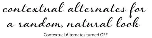
Contextual Alternates
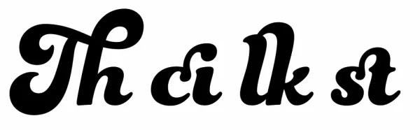
On by default in many applications, alternate letters are programmed to substitute one letter for another depending on what letter comes before or after the targeted letter for substitution. This feature may be used to enable better script joining behavior, to avoid awkward letter combinations, to create a more natural looking effect and sometimes for stylistic purposes.
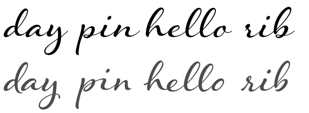
In the example below of Hummingbird, you’ll notice a lot of changes happening. Letters and words shown in gray are examples of contextual alternates activated.

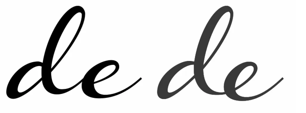
In the example below, both the letter /e/ and the letter before it substitute their forms resulting in a more natural connection. You’ll notice that without contextual alternates on, the letter /d/ doesn’t connect as well to the letter /e/ as it does with the feature activated.
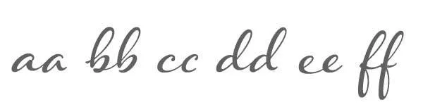
Another way contextual alternates can enable a more natural appearance is by avoiding having two letters in a row look identical to one another. By modifying one of the two letters, the font begins to look more like custom lettering.
I’ve also made some letters, like the letter /d/ drop below the baseline and the letter combinations such as /pin/ connect differently than their standard connections. You’ll notice too that the letter /h/ has a different beginning form and all of the letters have different ending forms as well. Effects like this are more similar to how handwriting connects and help to create a more random, natural appearance.
Read more about contextual alternates:
Stylistic Alternates
There are a couple of different uses for Stylistic Alternates, such as introducing a fancier or more casual letter or simply a different form than what’s used in the standard character set.
Font shown in example is Spumante.
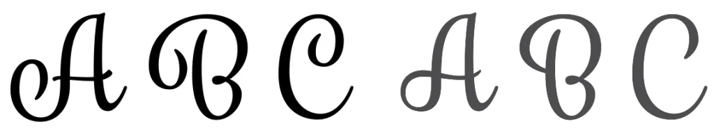
I also use Stylistic Alternates to substitute one variation of the letterform for another. This allows you to choose a style that may function, or look better in your design.
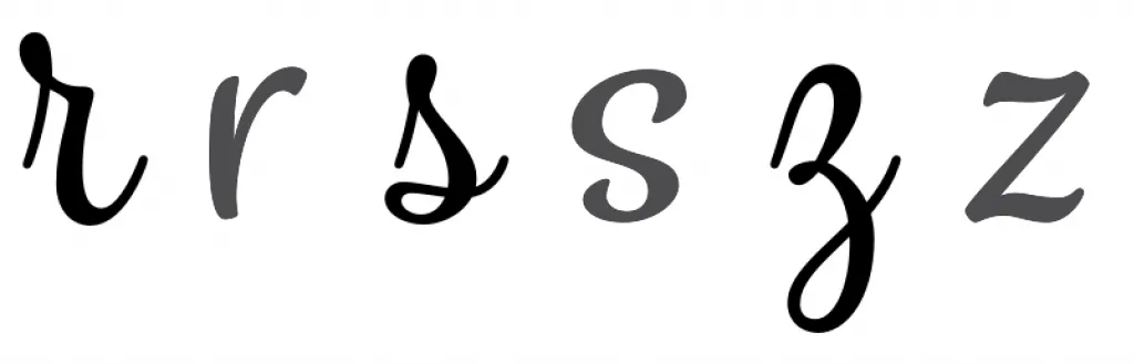
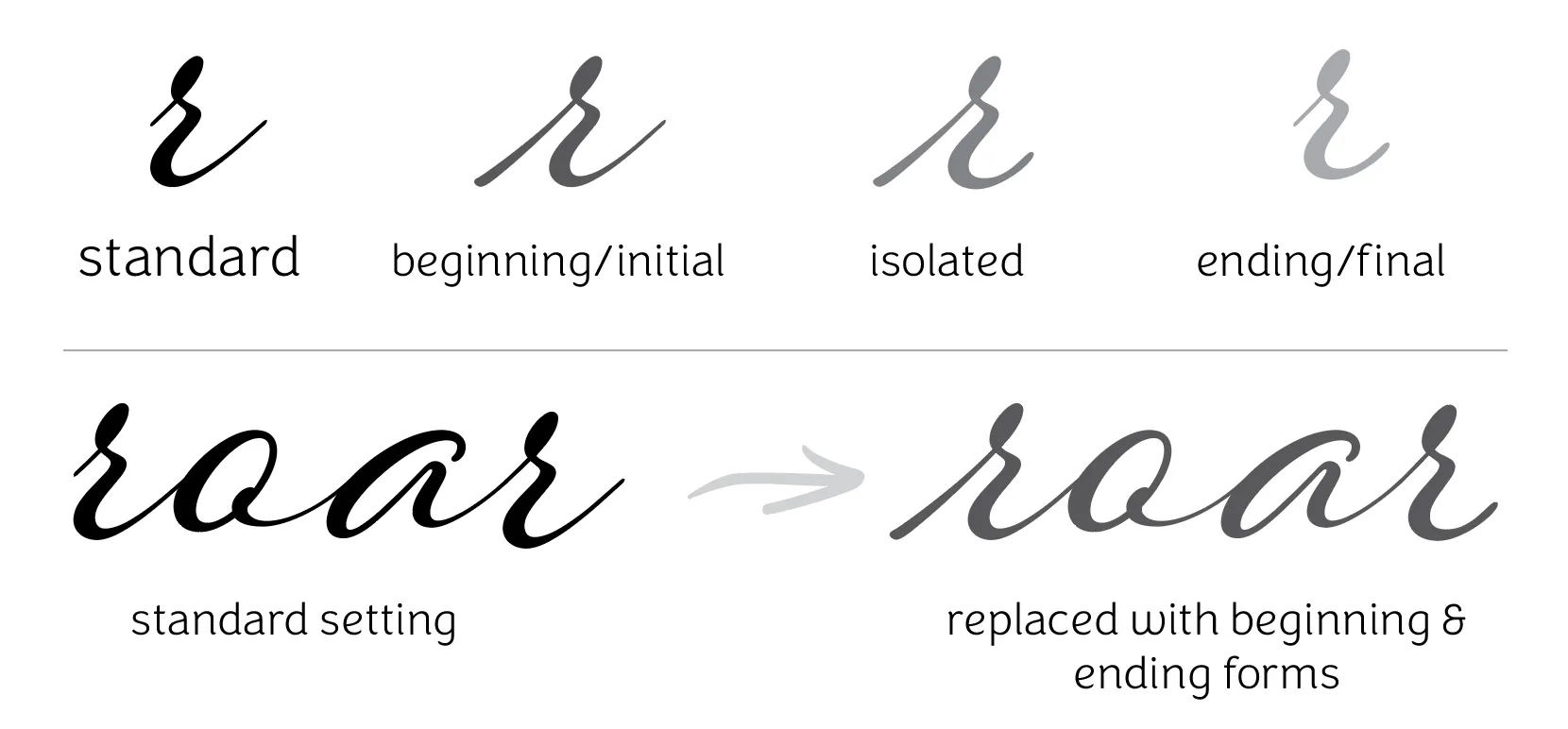
Beginning/Initial, Isolated, Ending/Final forms
You’ll find this feature in most of my script fonts; I think it’s essential for making the font look its best. If the contextual alternates feature is activated, these forms will show automatically. With certain letters, such as the r shown below, the standard letter is best suited for the middle of a word; it connects perfectly to any letter that precedes it, however, at the beginning of a word, it looks a bit odd… that’s not how one would naturally handwrite or hand letter that form. Therefore, I’ve introduced beginning, or initial forms into the font to make it look its best. The same concept is applied to ending forms; the exit stroke has been shortened so when the letter is at the end of a word, it looks ideal. When a letter has both a beginning and an ending form, an isolated form is introduced for the occasions where the letter needs to stand by itself.
Font shown in example is Hummingbird.
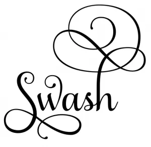
Swashes
Swashes are letters that have been extended and flourished for an expressive appearance. Use them sparingly as too many can overwhelm a word! I often use this feature to represent an entire set of alternate uppercase letters and occasionally, lowercase letters, however, as I design so many swashed letterforms, most of them are placed into Stylistic Sets instead.
Font shown in example is Samantha Script.
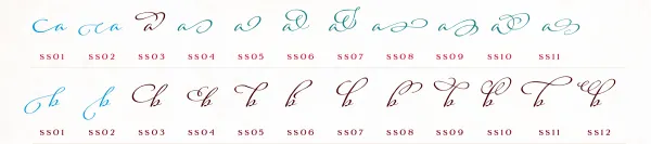
Stylistic Sets
Any swash or alternate letters that either haven’t been placed in the features previously mentioned, or times when there are an excess of what can fit in those features, often end up in Stylistic Sets. There can be up to 20 sets named SS01, SS02 and so on.
Font shown in example is Adorn Pomander.
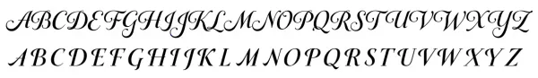
Titling Alternates
With sans serif and serif typefaces, Titling Alternates are typically used to introduce letterforms that are better suited for an all caps settings. However, I use the Titling feature a bit differently. Many of my script fonts have an alternate set of uppercase letters and the Titling features enables easy access to these. I have also used titling with some of my connected script fonts to enable an unconnected setting.
Font shown in example is Gioviale.
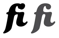
Ligatures
A ligature is the combination of two or more letters into a single letter to avoid unsightly collisions. Ligatures are almost always on by default in most applications.
Font shown in example is Funkydori.
Discretionary Ligatures
Discretionary Ligatures are used to create a stylized version of two or more letter combinations and can add visual interest to a word.
Font shown in example is Funkydori.
Small Caps (capital letters)
I haven’t used this feature often, however, you will see it in Yana. Small Caps are just a little taller than lowercase letters and designed to be used in a text setting, such as in a paragraph to blend in with the text and to look less conspicuous.
Font shown in example is Yana.
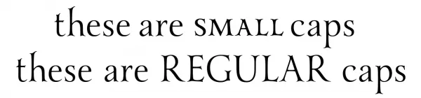
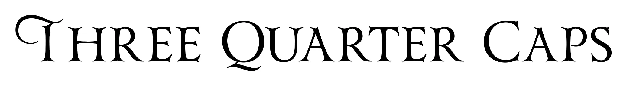
3/4 Caps
This is one of my favorite features for an all-caps setting; the first letter is a standard capital letter, the remaining capital letters are smaller. This presents an easier to read all-caps setting and sets off a swash cap nicely.
Font shown in example is Yana.
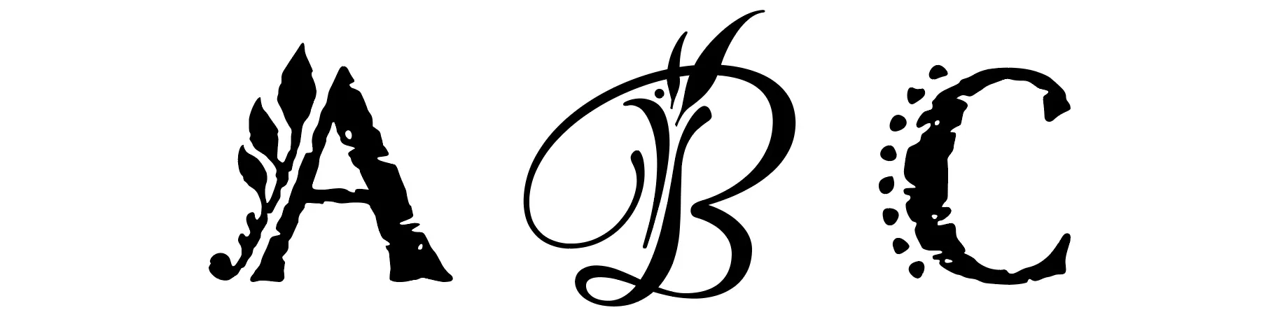
Decorated Caps
Capital letters with decorative elements as a part of the letter.
Fonts shown in example: Nelson and Hummingbird.
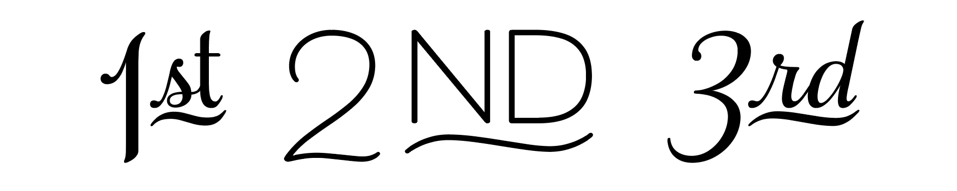
Ordinals
1st, 2nd, 3rd… styled perfectly within the font!
Fonts shown in example: Samantha Script and Beloved Sans.
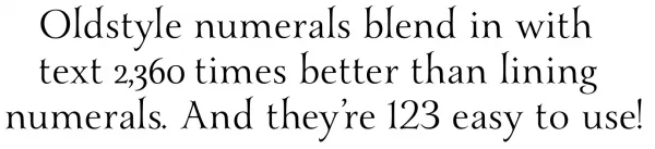
Lining and Old Style Numerals
Lining Numerals are figures that have a common height, about the size of capital letters. These are typically the standard numeral style in a font and they look best when paired with uppercase letters or used as a stand-alone setting, such as in an address or phone number.
Old Style Numerals have varying heights (ascenders such as b d f h k l) and lengths (descenders such as g j p q y). They are intended to blend in with text settings as they look more alphabetical in nature, featuring ascender and descender forms.
Font shown in example is Yana.
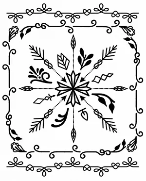
Frames
Frames are a sets of highly customizable elements offering a multitude of approaches to creating frames of any width, height, and style. Frames can be created with simple keystrokes or through direct selection from the Type Tester, a glyphs palette or a utility (more info). Use them for corner elements, borders, or to make an actual frame. Frames are available in the Adorn Collection, Adorn Smooth Collection, Boucherie, and Charcuterie.
Written Instructions | Video Demonstration
Banners
Banners, each with a mirrored image left and right element, can be created with simple keystrokes or through direct selection from the Type Tester, a glyphs palette or a utility (more info) and are available with a customized center that can be expanded to encapsulate a message or heading of any width. Frames are available in the Adorn Collection, Adorn Smooth Collection, Boucherie, and Charcuterie.
DIY Lines
DIY Lines are the perfect accessory for your design’s layout; containing decorative line elements, ornamental lines and more may be used to create rules, borders, frames and other ornamentation. DIY Lines can be created with simple keystrokes or through direct selection from the Type Tester, a glyphs palette or a utility (more info). DIY Lines are available in the Fairwater Collection.