Lettering
I had recently purchased some big rolls of paper and was having fun wasting it by drawing letters huge and gesturally.
It was very freeing and took me back to the days when I studied figure drawing and painting in college. This is where the concept for Hummingbird began. I longed to design an open and loose script that would have the feel of drawing without restraint.
But I wanted to take it a step further. I had decided I wanted this font to have the ring of handwriting’s authenticity to it, but with a more polished look. I sat down with a stack of blank paper and set about creating a handwriting/lettering style to discover what habits I would develop. When I finished my lettering drills, I reflected back on it and spotted a few patterns that I would later incorporate into the design.
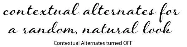
There are three main features that I built into Hummingbird’s contextual alternates setting that give it a natural flow and rhythm, based on the habits of handwriting, resulting in a random, organic appearance.
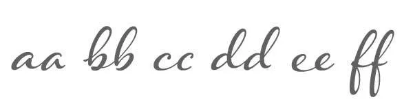
The first, and most obvious effect was to avoid having two of the same letters occur next to each other. When reviewing my lettering drills, at first glance, the letter a for example, looked pretty much the same from letter to letter, but upon close inspection, I realized that there were variances, but in most cases, the effect was slight. So, I created alternate letterforms that substitutes one of the two letters out.
The second feature reflects what happened when I started or ended a letter. With certain beginning forms, especially ones that have a loop in the ascender, there is usually a bit of a tail at the beginning of the loop that starts the letter’s form. At the end of a letter, the stroke often stops short when it is not anticipating connecting into another letter, or if you have a punctuation mark and want to avoid a collision. Shorter ending strokes also look cleaner. Thus, different beginnings and endings were designed.
Okay, so those were easy to incorporate into the design. Now for the third and most challenging feature of all: connections.
I chose to focus on the connections between letters as one main element in creating variations for contextual alternates. For example, look at the letter combination bi. When I looked over my handwriting, I found that I varied the b quite a bit to accommodate the high in-stroke of the letter i. I took the loop in the bowl of the b and flipped it up and out to connect to the top in-stroke of the i, and it created a considerable variation of the letter b, and a change to the letter i.

I looked through my handwriting and realized there were other noticeable changes I wanted to capitalize on as well. The letter that resulted in a need for a connection change was the letter e. Any letter that comes before e changes its out-stroke to loop into the e. It meant that both the letter that comes before it and the e itself would have to change forms in order to create a natural, flowing appearance from one letter to the next.
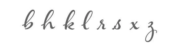
I also noticed that I didn’t always connect my letters together, so I decided to turn this into a semi-connected font when contextual alternates are on. I took the letters d, h, k, l, m, n, t, x and created a variation that would drop below the baseline when followed by the letters a, c, g, o, q, u, y.

There’s more than what I just mentioned above. I didn’t plan all of it in the beginning, it sort of happened by default as I started building out the typeface. I would run into situations where I would have a beginning form, like an h, followed by an e. The h would substitute for a beginning h, but then because of the e that followed, I had to create a beginning h that also would work when looping into the e. This continued on until I finished up with 214 contextual alternates. Some letters are fairly simple and only required three alternate forms. Others, like the z required many more – 15 in all. If you want to see all of the contextual alternate forms, check out the Hummingbird User Guide.
When I first decided to investigate the concept of randomization in fonts, I considered creating 3–5 alternates of each letter and creating a toggle effect, one that would result in words with multiple occurrences of the same letter substituting out for an alternate form to create that effect. That way, if you had a word such as ‘believe’ there would be three different variations on the letter ‘e’.
But then the fascination of how letters connect took over and I realized that if I employed the three features I mentioned above into the font, there would already be a lot of substitutions occurring, and that, in and of itself, was enough to create a random effect. I’ve calculated that about 60% of the letters change form with this setting turned on. Besides, I worried that if I tried to add in a toggle effect, I could be creating a font so complex it would be an absolute nightmare to manage and test, and I might not be able to find all of the potential issues – but I would have customers who would discover them. And I didn’t want that to happen!
So, I took a deep breath and decided what I had done suited the beginning goal of the project well. I had fun creating it, and I hope you like it!