In-Depth Design Process
I’ve worked with Joe Newton so long that I think of him as my personal art director. (Rather than the guy who, during his day job, creates brilliant book covers, brand identities, and spot graphics for the likes of the New York Times*, _Wired*, the School of Visual Arts, ESPN, and Rizzoli.)
Since 2011, Joe has created hundreds of gorgeous type specimens for me. While I focus on designing type, I know that Joe will be there to make my merchandising really sing. He sees the vision in my faces and often gives me great ideas on how to improve or extend them – a character here, an alternate there – and sometimes an entire complementary font. So it was only natural that I recruit Joe, through his studio Anderson Newton Design, to help me redesign my site. Read on to find out more about my right-hand man! — Laura Worthington
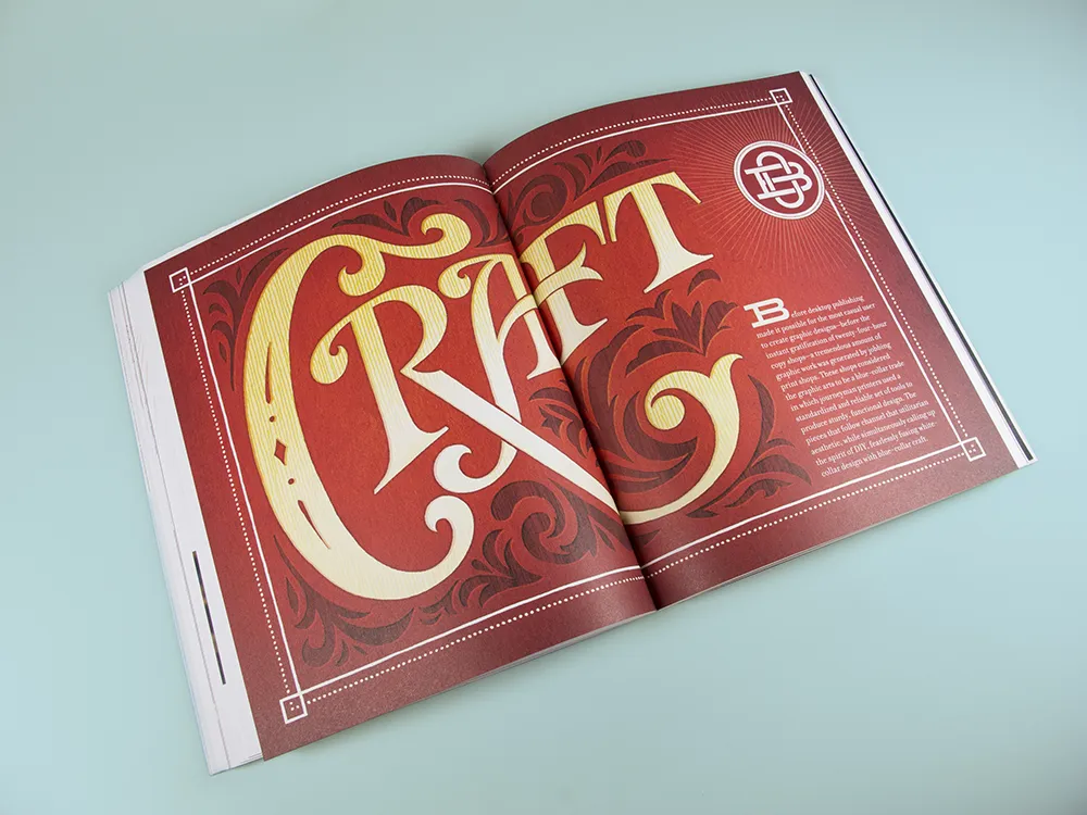
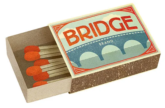
Designer Joe Newton has an eye for type. In his day job, he designs books and posters, builds brand identities, and creates spot illustrations, amongst other digital and physical things. Glance at his work – like a busy shopper, page-flipper, or site visitor might – and you’re instantly drawn in by his bold, surprising, and witty fusions of letters and images.
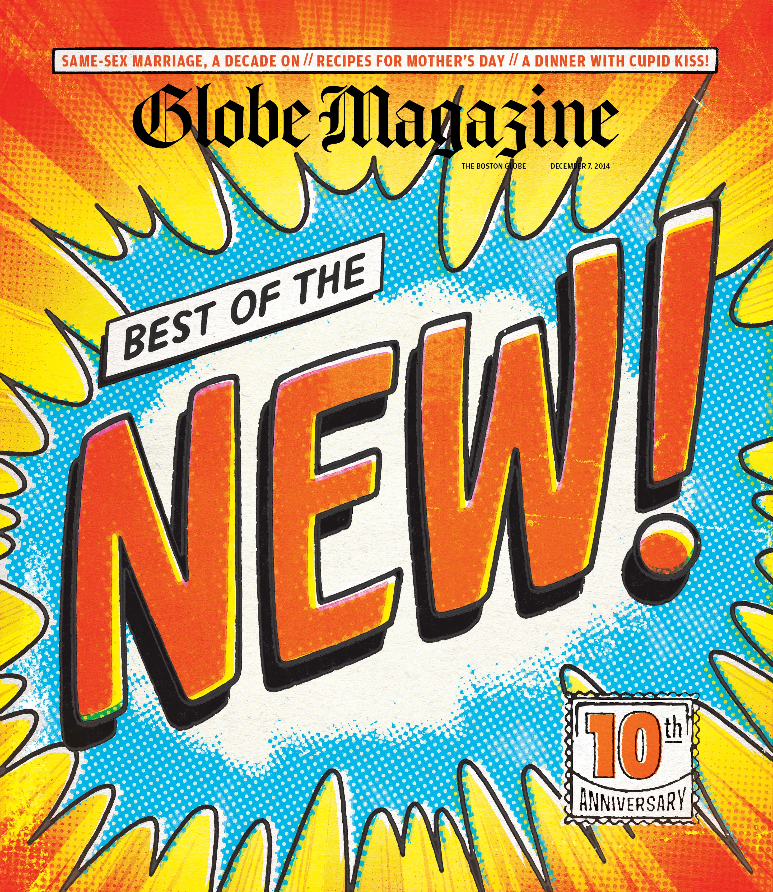
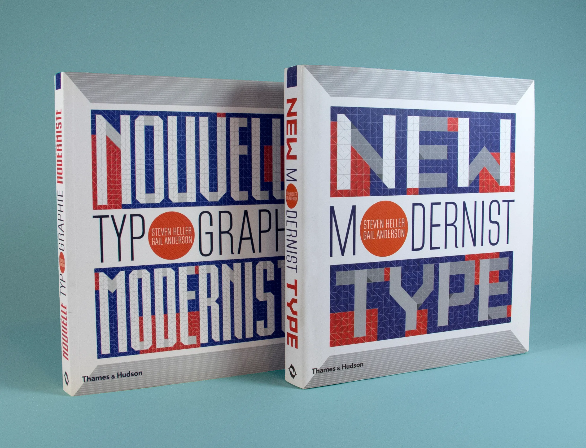
Images from top: Cover for Boston Globe magazine’s “Best of the New” 10th anniversary. Hand lettered section opener for Gail Anderson’s “Outside the Box” book. Spot illustration for the Savage Love advice column. Custom lettering for “New Modernist Type” cover.
Joe has a legit musical pedigree. He played in the band Gas Huffer, which focused his interest on design — creating posters, LP covers, and directing music videos. A lengthy stint followed as creative director for Seattle news weekly The Stranger. He moved to New York City and further honed his editorial chops as deputy art director at Rolling Stone. No wonder he sneaks so many musical references into his specimens.
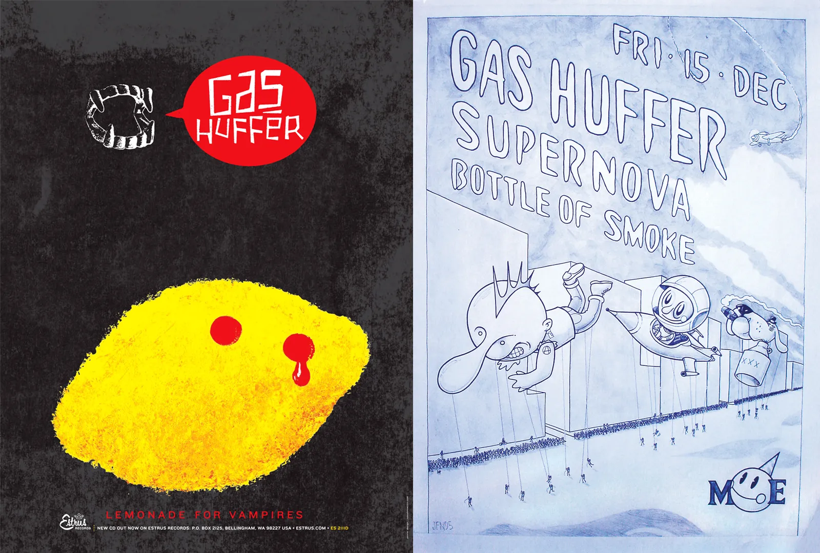
Posters for Gas Huffer’s final album “Lemonade for Vampires” and a show poster circa 1995.
After leaving Rolling Stone, Joe got seriously into the font business, leading the type division of the stock image company Veer. He reviewed thousands of contributions, set hundreds of specimens, and helped hundreds of type designers show their work in its best possible light.
“Glance at his work and you’re instantly drawn in by his bold, surprising, and witty fusions of letters and images.”
After Veer, Joe went on to partner with Gail Anderson to form Anderson Newton Design. Gail is a design legend with her own stellar typographic history with Rolling Stone, SpotCo, and the School of Visual Arts, and recently won a prestigious lifetime award from Cooper Hewitt.
But to my good fortune, Joe continued to keep one foot in the type promotion world with his specimens for Laura Worthington Design. The hundreds of type specimens Joe created form the core of the site. Everything else orbits around them.
Each specimen is meant to show the particular strength and character of the typeface, and help designers envision ways to use them.
“A type specimen is basically an advertisement for a typeface,” says Joe. “Like editorial design, I’m telling a story to the viewer. I’m talking about the best features of each face, calling out the details visually, providing context. And providing inspiration: here’s what this typeface can do.”
Joe has come to love the challenge of creating arresting designs from a single typeface. “I typically avoid using images, and never add any outside elements. Any graphic element you see in Laura’s specimens is made from the font’s letters or ornaments.”
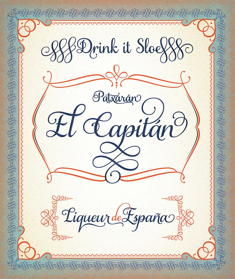
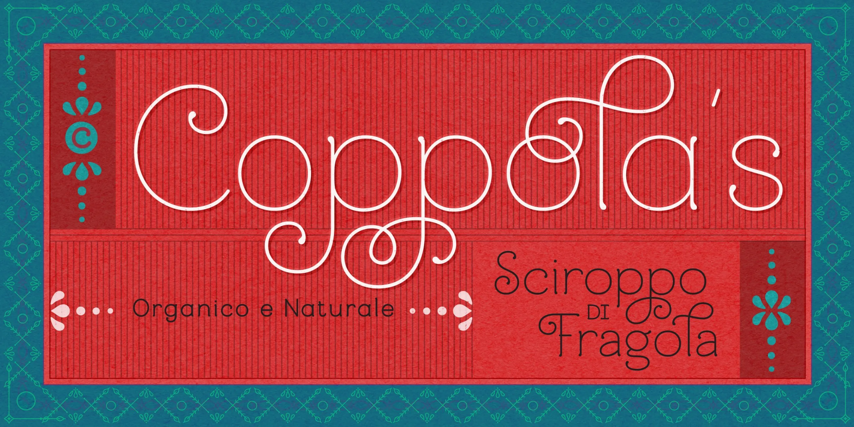
Top: A specimen for Samantha, created while at Veer. The border is created by repeating one of the ornaments found in the font. Bottom: The Mandevilla font does have ornaments, but here a complex pattern is created by overlapping and repeating various pieces. Both specimens are created using nothing but characters contained in the typefaces.
Joe collaborated with site developer Chris Lewis, who created an impressive type testing tool. Not only can you type in custom text, you can highlight individual letters and see available alternates, swapping in different glyphs to create custom settings.
I couldn’t be prouder of the site Joe, Gail and team have built. Joe makes my typefaces shine — and now he’s made my site shine, too.
JOE THANKS:
Shout out to Noel Nuñez-Caba for all his hard work on the design.
Photo courtesy of Lars Harmsen
All design work by Anderson Newton Design, except Savage Love Illustration, and Gas Huffer posters.
LINKS:
AndersonNewtonDesign.com
instagram: @thejoenewton
instagram: @andersonnewtondesign
Archive of Veer specimen work:
https://www.flickr.com/photos/thejoenewton/
Dj mixes (as DJ Señor Pepe)
https://www.mixcloud.com/Senor_Pepe/