Customer Spotlight
The thrill of seeing my fonts being used on products and packaging never gets old! What starts as an idea takes form with my pen and paper over countless hours.
And by countless, I mean on average 300 hours – the time it typically takes me to design a font from start to finish. Since starting my own business in 2010, I’ve had to really be diligent about my time and focus my efforts on the most important needs of my work. If you’re a woman, chances are you’ve struggled with how to get it all done in a day. Trying to balance work, family, pets and hobbies, there is often not enough time in a day to get everything done. Over the past year, I’ve looked for ways to help free up my time so that I can focus on what I love and what truly makes me the most happy.
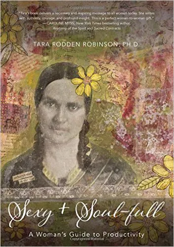
When I saw my font was going to be used on a new book cover design by Tara Rodden Robinson, Ph.D., a personal coach and productivity expert, I could hardly contain my excitement! Not only is her book, Sexy + Soul-full: A Woman’s Guide to Productivity, one that I can’t wait to read, but one that I wanted to share with you. Tara’s teaching really resonates with me and has helped me as I strive to “get it all done.”
She was excited to find fonts that were in the same family because she knew they would complement each other well.
I’m always fascinated by a person’s journey and how they came into a certain profession or landed where they are in life and Tara’s background is definitely fascinating. At twenty-eight years old, she dropped everything to move to Costa Rica where she fulfilled her dream of living and working in the rainforest. Since then, she’s earned a Ph.D. in biology, authored Genetics for Dummies, left academia to become an executive coach, and is now an internationally recognized expert in the field of personal productivity. As crazy as it sounds, she got interested in productivity because she was worried that she wasn’t living up to her potential!
Tara first found my fonts on MyFonts. She was looking for a font for her new book cover and searched “casual calligraphy.” She said she was immediately attracted to the Adorn family of fonts. Pomander is the font she chose for the book cover, because it’s such an expressive and feminine typeface – perfect for her audience. She used Engraved for the subtitle and author’s name on the title page, because she felt Engraved gives a formal feel while playing nicely with the more casual feel of Pomander. She was excited to find fonts that were in the same family because she knew they would complement each other well. That is one of the reasons I like to create families of fonts – so the end user won’t have to search around for fonts that complement each other. They know fonts in a family will work well together.
For more info on Tara, her new book or to check out her time-management-tip-filled blog, visit https://tararobinson.com/.