Customer Spotlight
I have many, many fabulous customers who I do business with every day.
And then I have the occasional fan who really, really loves my fonts. I’m talking loves them enough to use them on a tattoo – as in permanent body art! Cam Wilde is one such fan.
I first met Cam when I purchased a print and digital source file from a graphic design project he was working on. He had designed a simple visual graphic categorizing 100 of the most popular, influential and notorious typefaces of all time. It was a very cool project and he sent me a thank you note after my purchase. Through an email exchange, he discovered I was a typeface designer and was very excited to hear what I did for a living. I sent him a few of my fonts to try for his graphic design work. Here is what Cam had to say about what I sent him to try:
“Laura sent me Bianca, Samantha Upright, Ladybird, Yana and Recherché. I had a really good look at them all, set a ton of sample sentences, dove into the glyphs palette and was shocked. Most of them had so many alternates and extra goodies! I was still relatively new to the type world and some of the intricacies of properly setting type. Needless to say I was thrilled with the huge flexibility and quality down to the tiniest details of Laura’s typefaces and font files.”
I’m so grateful to Cam for being such a strong supporter and advocate of my fonts. He has designed for many amazing projects and firmly holds to the discipline that the typeface needs to fit the project or the brand and not the other way around. This shows through in his work. Take a look at some of what he’s done using my fonts; some of which he slightly modified:
New Mexico’s first full service food truck using my Charcuterie font!

Cam is on the board of directors for a non-profit railroad organization and did a massive overhaul of the organization’s logo using my Voltage font. The new logo and identity reflects the history of the local railroad as well as the organization itself and is designed to provide a more commercially attractive identity in order for the association to be able to raise more money through sales of branded merchandise.
![]()
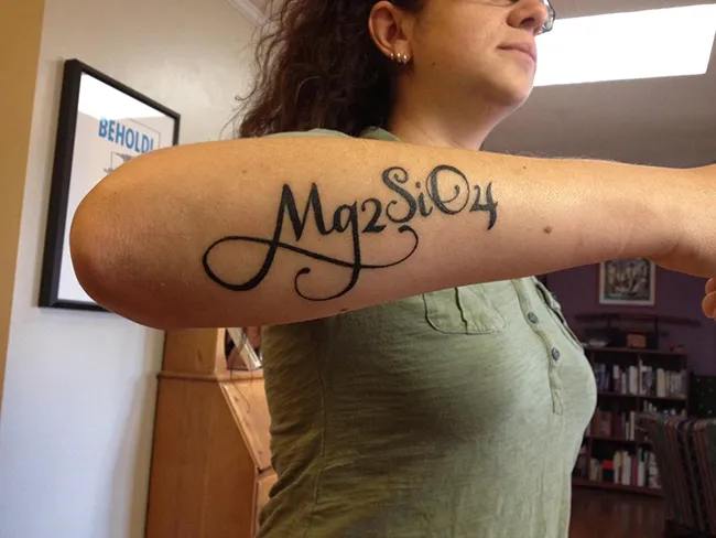
Beyond using my fonts in traditional graphic design applications, Cam used my Samantha Upright Pro to set one of his wife’s tattoos. Yes, you read that correctly! My font was used to create a tattoo! The tattoo itself says: Mg₂SiO₄ – which is the formula for the mineral Forsterite. Years ago NASA sent up a “collector” craft to capture stuff trailing behind a particular comet. The idea was that they’d capture lots of “stardust” and see what makes up stuff like that. Among other minerals and particles there was a lot of Forsterite. Cam’s wife loves the idea that we humans are ultimately all made of star stuff so the tattoo just symbolizes that idea. Wow! I’m so honored to have one of my fonts chosen for body art.
To see more of Cam’s work or to contact him, check him out on LinkedIn.