In-Depth Design Process
Tony Foster is an English artist who has worked in the world’s wildernesses – mountains and canyons, rainforests and deserts, the Arctic and the Tropics – for 30 years.
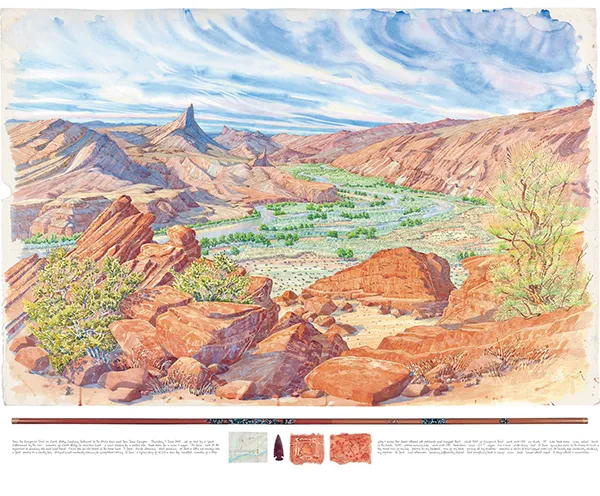
He travels slowly on foot, by canoe or raft, and carries his painting and camping equipment. He does not use photography or sketches, but makes his painting on site, often in the most difficult and uncomfortable circumstances. Sometimes a large-scale work (up to 7 feet by 4 feet!) will take more than two weeks on site. Once Tony feels his painting is in a good place, he will roll it into its aluminum tube to be finished in his studio in Cornwall.
Between 2009 and 2012, Tony traveled throughout the Four Corners region of the southwestern United States documenting the beauty of the natural landscape and his experiences. The region is the spiritual homeland of the Navajo, Ute, Havasupai, Paiute, Pueblo, Hopi, and Zuni people, and followers of the Catholic and Mormon faiths and New Age adherents also made their marks. This journey resulted in Sacred Places, an amazing compendium of thirty-four loose watercolor paintings, two large journals, a small notebook diary, memo book, postcards and a map of sites in Utah, Colorado, Arizona and New Mexico. Tony records his travels in a descriptive and poetic manner and this is included as part of his presentation. The result is fascinating; he takes you on a visual narrative through his artwork and the journeys involved in creating it. As such, his handwriting has become an important part of his identity and his brand.
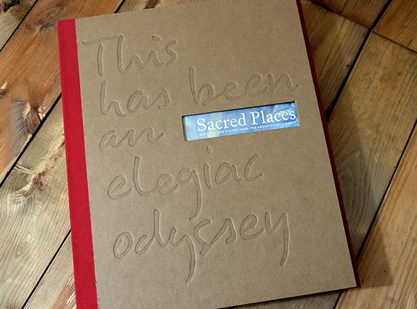
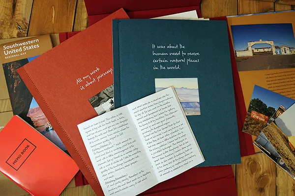
When Dan Saal, the designer of this book, wanted to create a custom font based on Tony’s handwriting to use throughout the book and in other collateral, I was excited for the opportunity to work on it. Up until this point, all but one (a commissioned typeface I can’t discuss yet, top secret!) of my typefaces have been based off of my own lettering and sketches. However, it was a new challenge and I find handwriting to be intriguing and thought it’d be a great learning experience, and the opportunity to see the font used on a large scale in a book, was something I couldn’t resist! Tony is a truly amazing artist and his book, Sacred Places, was a project I am so proud to have participated in!
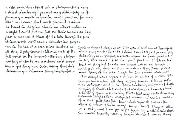
Handwriting fonts present a unique challenge. When we handwrite, every letter is different – you can write the same letter over and over and no two will ever be identical. Therefore, I brought in two to four versions of each letter into the font so that duplicate letter occurrences could be avoided. Also, Tony’s handwriting is semi-connected – the way the letters connect together is what really makes this font look authentic. As such, I developed and employed an enormous amount of ligatures (over 200!) to truly capture the look of his handwriting. Instead of using ligatures to avoid collisions or to add in a stylistic element, these ligatures were used to develop a style to replicate his handwriting. You can see by this example the role that ligatures play in this font.
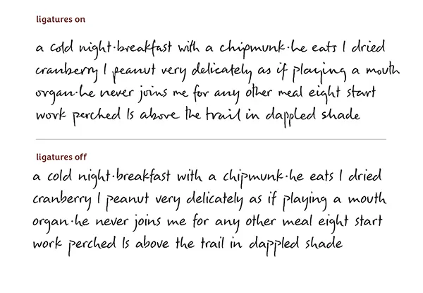
Here’s an example of his handwriting (bottom right) and the font (top left). A couple of letters were modified for better legibility but the goal was to keep it as close to his writing as possible.

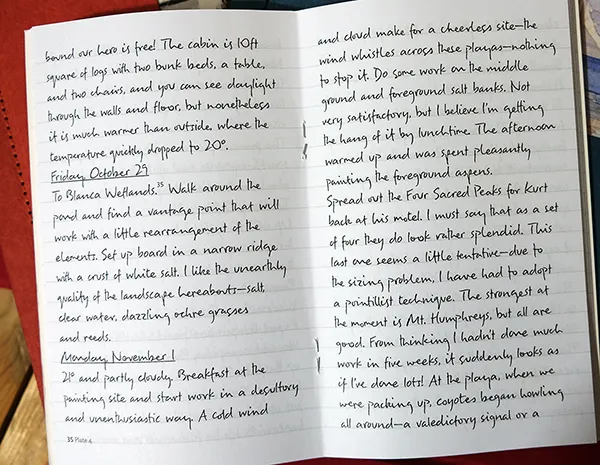
I looked through pages and pages of his writings and developed a list of the most commonly used two to four letter combinations along with a few of the most commonly used words in his writing. This is something that varies – for example, in the English language, there’s a difference of letter and word use frequency from the written language and our spoken language, and so keeping this in mind, I chose to seek out those combinations pertinent to his writing style and vocabulary and make them into ligatures.
The result is a truly unique, one of a kind font for a truly unique, one of a kind book.
For more information on Tony Foster and Sacred Places, visit
http://www.tony-foster.co.uk/exhibition/sacred-places