Lettering
The idea for Al Fresco began back in April of this year (2013.)
I was invited to teach a brush lettering workshop for Type Camp. As I put the information together, bought supplies, researched and planned for it, I also set about refining my brush lettering skills and the processes I would use for instruction. Up to this point, I had always been more of a pointed pen girl – I did brush lettering from time to time, but overall, it was less familiar to me. I wanted to increase my speed and comfort with the brush, so I dedicated time to practice it over several months. As a result, a distinct lettering style began to form.
(I’m planning on writing more about the brush lettering process I use in depth, so check back for that – it will be nothing short of a novella!)
Below, I’ve shown scans of the lettering I created that were used as the basis for this typeface. In some of these images, you can see the pencil stroke below the letter. In teaching brush lettering, I discuss using pencil skeletons as a starting place. It’s an effective method for planning, and when you retrace the letters several times, you develop muscle memory – which makes it easier to approach when you get the brush in your hand.
“What I like about felt brushes is that they have a fixed tip and are easier to control than a regular pointed brush that has soft, loose bristles.”
For Al Fresco, I used Prismacolor felt brush pens. I went through about 7-8 of them – which is a lot – but the tips degrade quickly and I’m not concerned with being careful when using them. When I taught the brush lettering workshops, this was the primary tool I used for instruction. What I like about felt brushes is that they have a fixed tip and are easier to control than a regular pointed brush that has soft, loose bristles. Plus, I believe them to be more familiar to a beginner as you can hold them similarly to that of a pen or pencil.
After I had scanned in the pages of lettering, I set about redrawing and completing the final design in FontLab. I usually find typeface design to be very challenging – but not with Al Fresco – I finished it with ease. I believe the amount of time I spent thinking about the process and practicing it had everything to do with this and I believe it shows through in the typeface itself. The looseness and the easy, casual feel of it speaks to the level of comfort and familiarity I now have when using a brush for lettering.
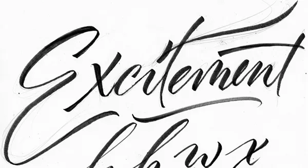
When first getting started on lettering for type design, I work with words, rather than letters. It’s important to see how the letters will work together, taking into consideration the connecting strokes, possible collisions and how to fix them, and what the overall word-shape will look like.
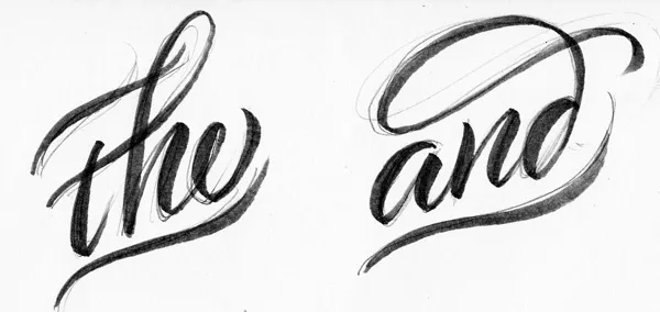
catchwords
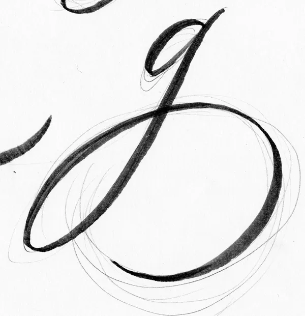
swash /g/
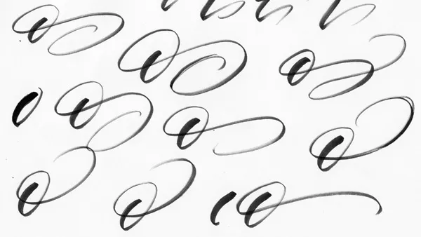
exploration of different types of swashes that can be made on the lowercase /o/
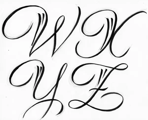
Swash uppercase letters
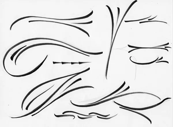
Some of Al Fresco’s flourishes and ornaments